In February 2013 I wrote an editorial entitled “Where’s the Warming?” My argument was that the IPCC was facing a significant problem in writing the then-upcoming AR5 because the most recent global temperature data was showing a drop in global average temperatures contrary to its computer model results.
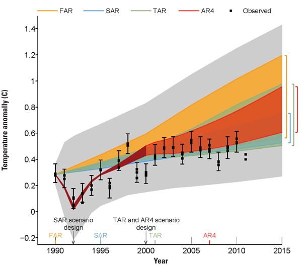
One of the reviewers of the draft report wrestled with the same question and portions of the 1,000+-page draft report were anonymously released. The reviewer said that the public had a right to know that the IPCC leadership had sanitized the report and its conclusions.The crux of the problem was, “The writers of WG1, for the first time since AR1 was released in 1990, were forced to admit that measured global temperature data does not match their most wishful computer modeling results.” I went on to say, “Figure 1.4 from the WG1 draft report is illuminating.” Mind you, this figure has played a prominent role in “proving” AGW since the IPCC released its first assessment report in 1990. It is the “smoking gun” the IPCC has trumpeted for many years (Figure 1).
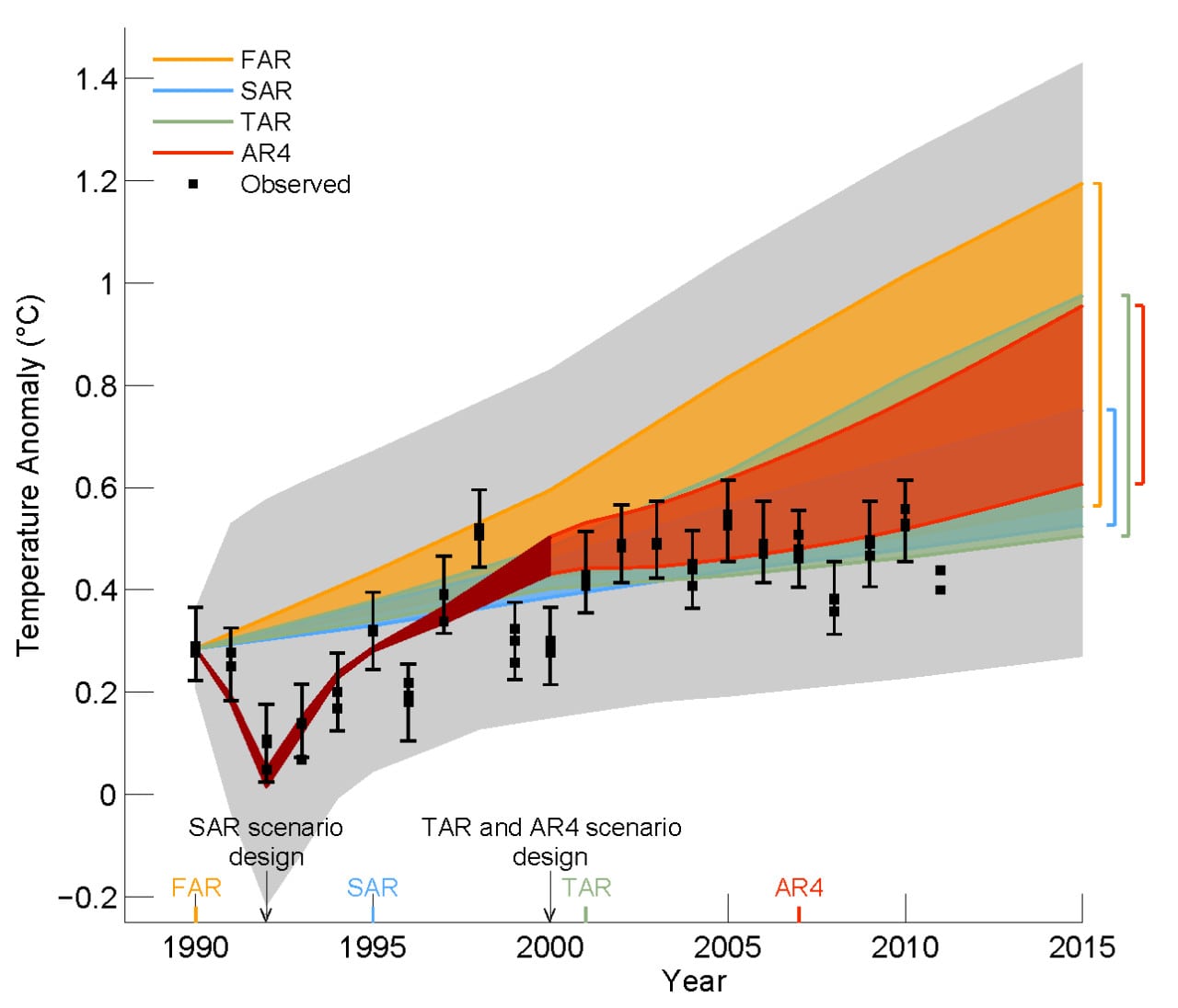
1. From the AR5 draft report. Note the trend in global average annual temperatures versus the IPCC predicted temperature rise. Source: IPCC AR5 Draft Report
I went on to say in the editorial, “In sum, the observational temperature data lies outside (below) the 90% confidence range of its models (model and year published as noted).” In essence the IPCC report’s projected range of global annual mean near surface temperatures exceeded measured temperatures. In fact, the global measured temperatures are less than the lowest predicted temperatures by a wide margin. I concluded by observing, “This figure alone confirms that there has been no statistical warming since 1995, much less the long predicted AGW.”
Naturally, when the Second Order Draft prepared by WG1 for the upcoming AR5 release was posted on the IPCC website, I quickly looked to see how the authors planned to finesse the obvious cooling trend in their favorite figure.
They took the direct approach to solving the problem: the figure was deleted. In its place is a figure that intentionally obscures the now obvious cooling trend (Figure 2). The replacement figure was added without explanation after the final draft completed its review (with Figure 1.4—Figure 1 above) yet was edited out right before the Second Order Draft (SOD) was publicly released.
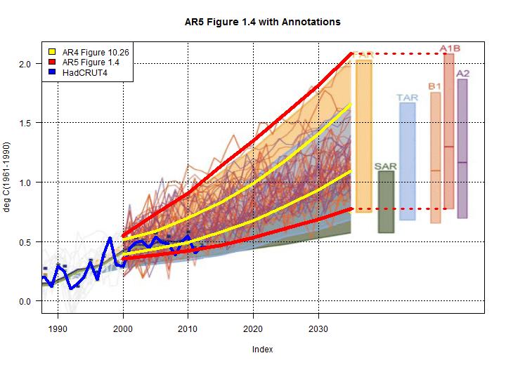
Figure 2. From the IPCC AR5 Second Order Draft (DOC). The error bands and global average temperatures from Figure 1 were deleted/obscured. Steve McIntyre back calculated from data sources provided within the SOD and produced the familiar error bands, The blue line shows the average temperatures shown in previous drafts.
The replacement figure was analyzed by Steve McIntyre (best known for exploding Michael Mann’s “hockey stick” theory) using data found elsewhere in the report and marked on the IPCC figure (shown on Figure 2). The added red lines show the AR5 confidence bands released in the first draft report, the yellow lines are from AR4, and the blue line is the global average temperature data that is obscured in the maze of trend lines (and in Figure 1). In spite of the IPCC’s best efforts, the cooling trend remains prominent.
–Dr. Robert Peltier, PE, Consulting Editor