Sankey Diagram
-
 News
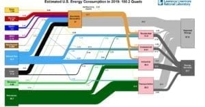
NewsChart Shows Rise in Wind, Solar; Overall Drop in Energy Use
Lawrence Livermore National Laboratory’s (LLNL’s) latest annual energy flow chart suggests that in 2019, for the second year in a row, wind and solar made up the largest increases in U.S. energy supply, but American consumption of energy fell after a record year in 2018. The national lab’s annual U.S. energy flow chart, or Sankey […]